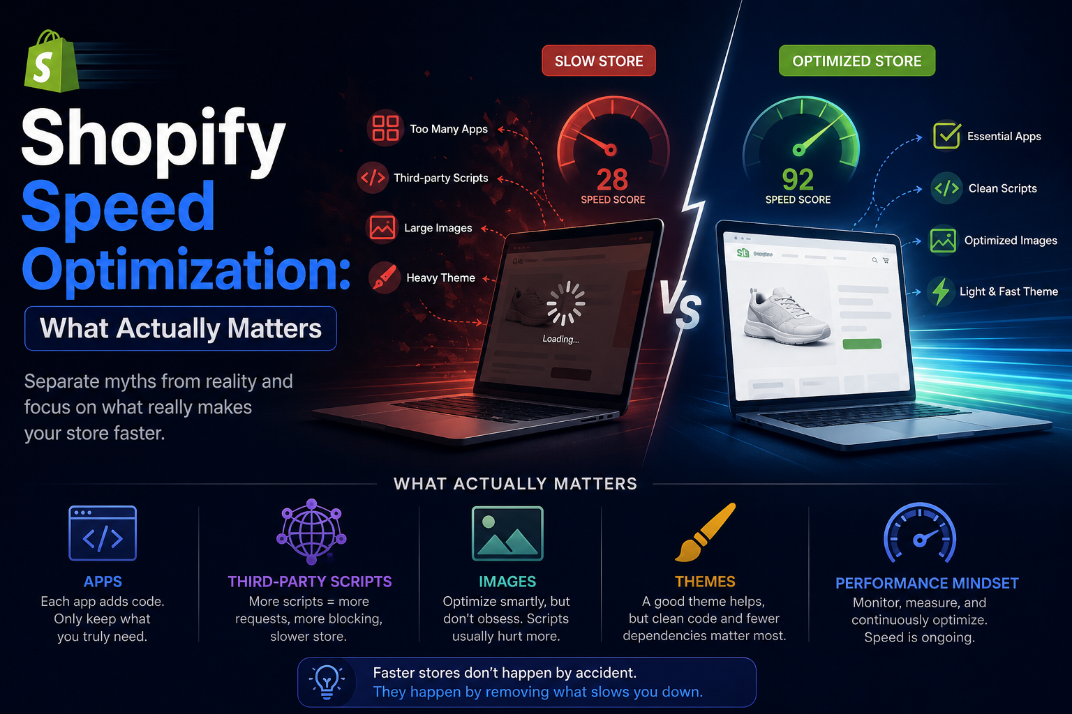
Why Your Shopify Store Feels Slow on Mobile But Fine on Desktop
If your Shopify store loads fast on a laptop but drags on phones, you're not imagining it. Here's the real reason mobile feels different — and what you can actually do about it.
It's one of the most common Shopify performance complaints, and it usually sounds something like this:
"Everything looks great when I test on my laptop, but customers on phones keep telling me the store feels slow."
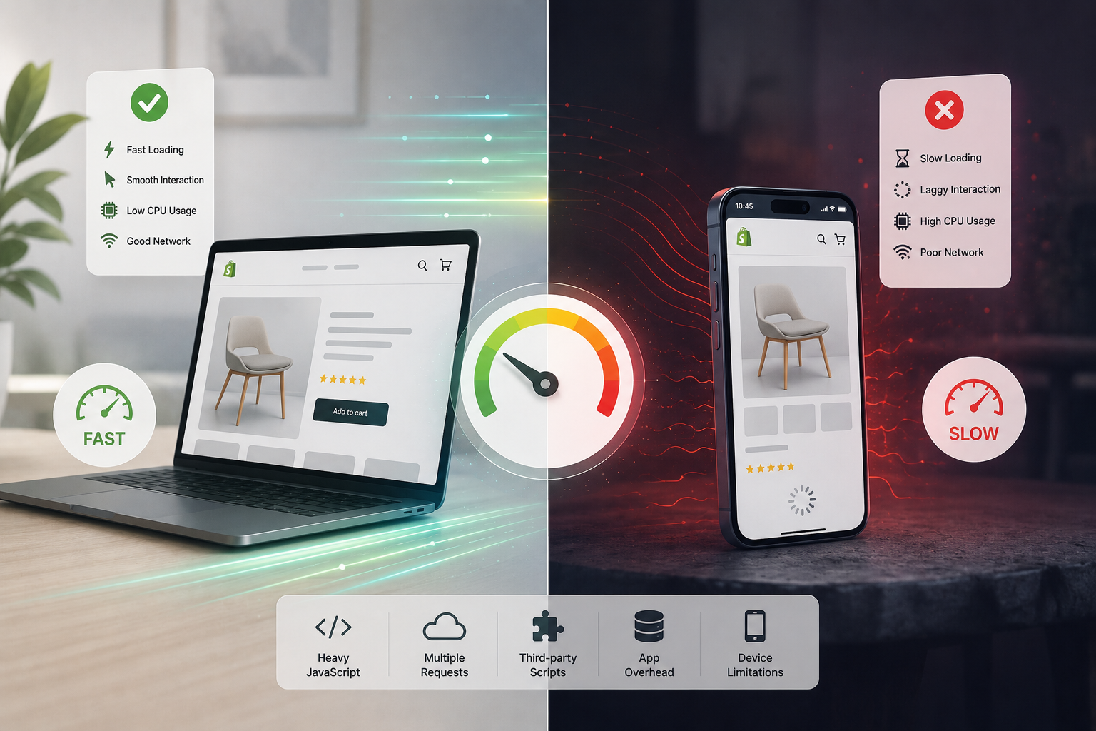
If that sounds familiar, you're not dealing with a perception problem — you're dealing with a real technical gap between how desktop browsers and mobile browsers experience your storefront. The same store, the same code, the same scripts can behave dramatically differently depending on the device trying to run them.
This isn't a Shopify-specific problem. It's a consequence of how modern storefronts are built — and understanding why it happens is the first step to fixing it.
Desktop and Mobile Are Not Having the Same Experience
When you test your store on a MacBook or a desktop, you're running it on hardware with a fast multi-core processor, plenty of RAM, active cooling, and (usually) a stable Wi-Fi or ethernet connection. The browser has plenty of resources to absorb complexity.
A mid-range Android phone — which is what a large portion of your mobile customers are actually using — is working with a fraction of that. Slower CPU cores, less memory, no active cooling that can sustain peak performance, and a mobile network that might be switching between 4G and 3G depending on where the customer is standing.
The storefront hasn't changed. The execution environment has changed dramatically.
The Three Reasons Mobile Feels Slower
1. JavaScript Execution Is Far More Expensive on Mobile CPUs
This is the biggest factor, and it's the one most merchants don't think about.
When a customer opens your Shopify store, the browser isn't just downloading a page — it's executing code. It parses your HTML and CSS, runs every JavaScript file it encounters, evaluates app scripts, attaches event listeners, renders dynamic content, and makes your store interactive. All of that takes CPU time.
On a fast laptop, this happens so quickly it's imperceptible. On a mid-range phone, the same workload can take two, three, or four times as long — not because the phone has a worse internet connection, but because it's doing genuine computational work with a slower processor.
Every app you've installed contributes to this workload. Upsell widgets, live chat, heatmap recorders, personalization engines, recommendation systems, dynamic filtering — all of these execute JavaScript continuously, not just during the initial page load. On desktop, that background execution is invisible. On mobile, it's the reason buttons feel sluggish and cart drawers hesitate.
CPU execution time
3–5x slower
on mid-range Android vs. modern laptop
This also explains why Total Blocking Time (TBT) — one of Google's Core Web Vitals — matters so much for mobile. Long tasks that block the main thread are barely noticeable on desktop. On a phone, they create visible input delay: the customer taps "Add to Cart" and nothing happens for a moment. That moment is enough to break trust.
2. Mobile Networks Add Latency That Wi-Fi Hides
Desktop testing almost always happens on fast, stable Wi-Fi or ethernet. Mobile customers browse on 4G, on weak Wi-Fi in a café, on a signal that drops and recovers as they move around. Every network request your storefront makes is subject to that variability.
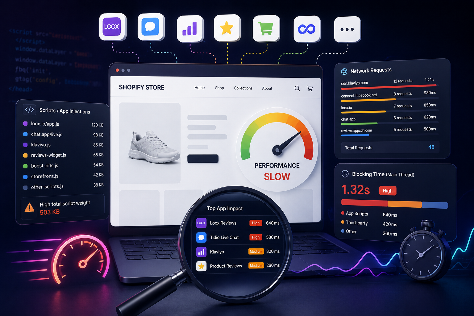
Modern Shopify stores commonly load resources from dozens of external domains simultaneously — analytics platforms, ad networks, app servers, chat systems, recommendation engines, tracking providers. Each one of those requests involves a DNS lookup, a TLS handshake, and a download. On a fast home network, this overhead is negligible. On a congested 4G connection, it stacks up noticeably.
External domains
20–40+
typical on a store with 8+ apps
The practical implication: reducing third-party network requests has a disproportionate impact on mobile performance. Every integration you can eliminate — or consolidate — shortens the queue of requests your mobile customers have to wait through.
3. Apps That Feel Fine on Desktop Can Break Mobile
Apps are often the most overlooked variable in Shopify mobile performance. Because app impact is hard to see from the Shopify Admin, and because desktop testing makes apps feel acceptable, merchants frequently don't realize how much their app stack is hurting the mobile experience.
The categories that show up most consistently as mobile performance problems:
Tracking & Analytics — Multiple pixels and heatmap tools compete for network requests and CPU time. Each adds overhead that's amplified on slower hardware and connections.
Live Chat and Support Widgets — These are notoriously heavy. Most load their full JavaScript interface on every page, even on visitors who will never open the chat. On mobile, that background payload is felt.
Visual Enhancement Apps — Sliders, animated popups, floating banners, and countdown timers introduce JavaScript animation loops and DOM manipulation that are particularly expensive on mobile CPUs.
Personalization and Recommendation Engines — Real-time AI recommendations often require API calls that happen during or after page load, extending the time before the page feels fully interactive.
Why Lighthouse Scores Can Be Misleading Here
One of the reasons this problem persists is that performance testing often happens in conditions that don't reflect mobile reality.
Chrome's Lighthouse tool does simulate mobile conditions — it applies CPU throttling and a slower network profile — which is why your mobile Lighthouse score is almost always worse than your desktop score. But there's a gap between what Lighthouse simulates and what a real customer experiences on a real device with real network variability.
If your Lighthouse mobile score looks borderline acceptable but customers are reporting a slow experience, trust the customers. Synthetic benchmarks are useful for tracking regressions, but real-device testing on mid-range phones is what tells you the truth.
Why Mobile Performance Matters More Than It Used To
For most Shopify stores, mobile now accounts for the majority of traffic. That means your mobile experience isn't a secondary concern — it's the primary one.
The commercial stakes are direct: a store that feels slow on phones has higher bounce rates, lower add-to-cart rates, and worse checkout completion. If you're running paid traffic, slow mobile landing pages mean lower Quality Scores on Google Ads and worse CPMs on Meta, which means you're paying more for the same traffic. And since Google uses Core Web Vitals as a ranking signal with mobile-first indexing, mobile slowness affects your organic visibility too.
How to Actually Improve Shopify Mobile Performance
Start by Reducing JavaScript — It Has the Highest Impact
Script reduction consistently produces the largest mobile performance gains. Audit every installed app and third-party integration with a simple question: does this earn its performance cost?
For each app, consider:
- Is it actively being used, or was it installed for something that never launched?
- Does it load on every page, or only where it's actually needed?
- Does it provide measurable business value, or is it nice-to-have?
- Has anyone checked for a lighter native Shopify alternative?
Apps that can't answer those questions are candidates for removal. Every script you eliminate is CPU time and network overhead your mobile customers get back.
Audit Your Tracking Pixel Stack
Marketing teams add pixels when campaigns launch. They rarely remove them when campaigns change. Over time, a typical Shopify store accumulates tracking from Meta, Google Ads, TikTok, Pinterest, affiliate networks, and retargeting platforms — all running simultaneously on every page load.
Review the full list of active tracking scripts with your marketing team quarterly. Remove anything tied to a platform you're not actively advertising on. The mobile performance gains from cutting two or three unused pixels are often more noticeable than anything a speed optimization app can deliver.
Clean Up Ghost Code from Uninstalled Apps
Removing an app from Shopify doesn't remove its code from your theme. Liquid snippets, script tags, and app embeds frequently remain loaded after uninstall, continuing to fire on every page — including on mobile — indefinitely.
After any app removal, manually check your theme files for leftover code. It's tedious, but it prevents a common source of invisible mobile drag that compounds quietly over time.
Monitor What's Actually Loading — Automatically
The fundamental challenge with Shopify mobile performance is visibility. You can't feel what your mobile customers feel from your admin dashboard. You need to see what the browser actually loads.
StoreOwl monitors your storefront daily, tracking script payload, blocking time, and third-party request count automatically — so you know immediately when a new app install or campaign pixel changes your mobile performance baseline. Instead of discovering a problem months after it started affecting conversions, you catch it the day it appears.
Focus on Interaction Speed, Not Just Load Time
A page that visually appears quickly but responds slowly to taps and swipes still feels slow to mobile customers. Interaction to Next Paint (INP) — Google's metric for measuring how quickly a page responds to user input — is often a better indicator of mobile experience quality than initial load time.
Reducing background JavaScript execution and main-thread blocking time improves INP directly. This is where app auditing pays off most clearly on mobile: fewer scripts running means the browser's main thread is available to respond to taps immediately.
Key Takeaway
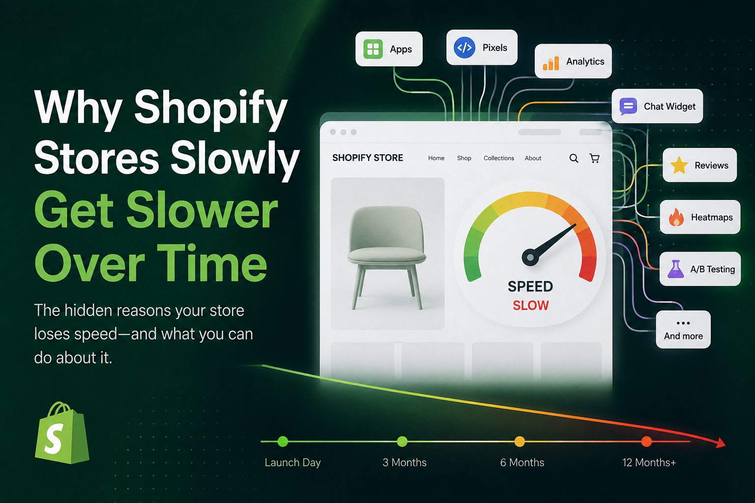
If your Shopify store feels fine on desktop but slow on mobile, the cause is almost never a single issue — it's the accumulated weight of scripts, apps, and third-party requests hitting a device that simply has less capacity to absorb them.
The gap between desktop and mobile performance usually grows over time, as each new app install and tracking pixel adds overhead that mobile devices feel more than desktop ones. The stores that close that gap aren't the ones that found a clever optimization trick. They're the ones that keep their storefronts lean, audit their scripts regularly, and monitor mobile performance continuously so regressions don't go unnoticed.
Start with a free StoreOwl scan to see exactly what's loading on your storefront — and how much of it your mobile customers are carrying.